


Admin ADMIN
2026.08.11
 AdminBug reports 23Suggestions 4Exploits 0
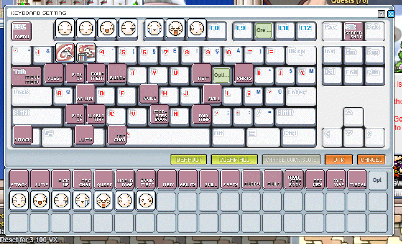
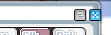
Confirmed. The two buttons are correctly aligned with each other, but the pair as a whole sits about 8 pixels too far right — the X ends up half on the window's outer frame instead of inside the white title bar, which is why it looks like it's falling off the corner.
This came from a coordinate we borrowed from a reference client, which puts the close button 12 pixels in from the window's right edge. That works on a window whose frame is thin, but this window's title bar is a white box that stops 9 pixels short of the outer edge — so 8 of the button's 12 pixels land on the frame.
I measured the actual artwork: the white title box runs from pixel 6 to pixel 620 across, and rows 6 to 19 down. Both buttons now sit inside it — the X's right edge 2 pixels in from the box edge, and both vertically centred in the bar. The "?" keeps its existing 3-pixel gap to the left of the X.
This came from a coordinate we borrowed from a reference client, which puts the close button 12 pixels in from the window's right edge. That works on a window whose frame is thin, but this window's title bar is a white box that stops 9 pixels short of the outer edge — so 8 of the button's 12 pixels land on the frame.
I measured the actual artwork: the white title box runs from pixel 6 to pixel 620 across, and rows 6 to 19 down. Both buttons now sit inside it — the X's right edge 2 pixels in from the box edge, and both vertically centred in the bar. The "?" keeps its existing 3-pixel gap to the left of the X.