


Admin ADMIN
2026.08.11
 AdminBug reports 23Suggestions 4Exploits 0
Confirmed — the buttons are in the wrong place.
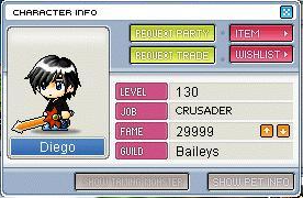
I pulled the real v83 window artwork apart to check. The plate is 275x199 and it has three empty areas the client fills in: a blue band across the top-right (next to the character), the five label boxes down the middle, and a blue strip along the bottom. On the real client the four action buttons — REQUEST PARTY and REQUEST TRADE on the left, ITEM and WISHLIST on the right — sit in that top-right blue band as a 2x2 block, exactly like your Diego screenshot. The bottom strip is for the two SHOW PET INFO / SHOW MOUNT INFO toggles.
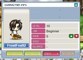
We put all four in the bottom strip in one row instead, and we dropped WISHLIST entirely. That's the fix: move the four into the top-right block, add the wishlist button back, and give the bottom strip the pet/mount toggles.
One thing that isn't wrong, so you know: our extra ALLIANCE row is genuine. The v83 plate has LEVEL, JOB, FAME, GUILD *and* ALLIANCE printed into it. Your Diego screenshot is from an older client that predates alliances, which is why it only shows four. We'll keep the five.
I pulled the real v83 window artwork apart to check. The plate is 275x199 and it has three empty areas the client fills in: a blue band across the top-right (next to the character), the five label boxes down the middle, and a blue strip along the bottom. On the real client the four action buttons — REQUEST PARTY and REQUEST TRADE on the left, ITEM and WISHLIST on the right — sit in that top-right blue band as a 2x2 block, exactly like your Diego screenshot. The bottom strip is for the two SHOW PET INFO / SHOW MOUNT INFO toggles.
We put all four in the bottom strip in one row instead, and we dropped WISHLIST entirely. That's the fix: move the four into the top-right block, add the wishlist button back, and give the bottom strip the pet/mount toggles.
One thing that isn't wrong, so you know: our extra ALLIANCE row is genuine. The v83 plate has LEVEL, JOB, FAME, GUILD *and* ALLIANCE printed into it. Your Diego screenshot is from an older client that predates alliances, which is why it only shows four. We'll keep the five.