
HOMEFORUMSUPPORTDISCORD
★ TEST
✦ Welcome to the MapleVerse Test Portal! ✦  Found a bug? Report it here — paste a screenshot right from your clipboard! ✦  8 issues being tracked — thank you, testers! ✦✦ Welcome to the MapleVerse Test Portal! ✦  Found a bug? Report it here — paste a screenshot right from your clipboard! ✦  8 issues being tracked — thank you, testers! ✦
#125 Add a bug report button to homepage FIXED
LOW Website 🍄reported by Mark · 2026.08.07 · updated 2026.08.14
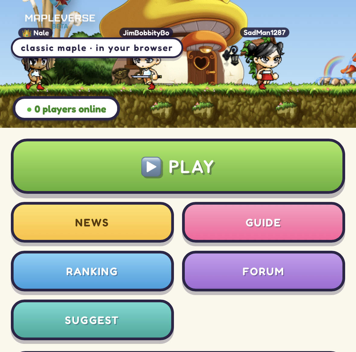
Add a bug report button that leads to the /test section with the other menu buttons in the website to fill that empty slot
screenshot 1
🍅 ME TOO · 0 Sign in to confirm this bug.
COMMENTS 4 replies
Admin ADMIN 2026.08.11

Agreed, and it's a quick one — that gap next to SUGGEST has been bugging me too.

The menu is built from one list in the site's shared config, and it happens to have six entries against a two-across grid, which is why the last row is half empty. I'm adding a seventh, REPORT BUG, sitting between SUGGEST and PLAY and going straight to the report form in the test portal — so it lands in the empty slot exactly as you described, and TEST PORTAL stays in the top strip for people who want the full list.

It gets its own colour (orange) so it doesn't read as a second SUGGEST button. PLAY keeps its green and stays pinned to the top of the menu — it's positioned by name, not by counting, so adding a button in front of it doesn't move it.

Heads up that it goes to the form, which asks you to log in before you can post — same account as the forum, same as SUGGEST does today.
Admin ADMIN 2026.08.11
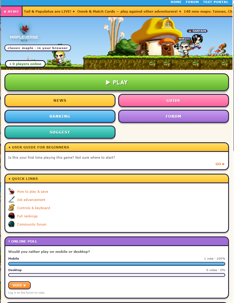
Fair point — reporting a bug was two clicks and a guess away. The only routes in were the small TEST PORTAL link in the thin blue strip at the very top, and the SUGGEST button, which goes to the ideas form rather than the bug form. Neither says "bug".

This adds a FOUND A BUG? panel to the left column of the homepage, directly under the PLAY/NEWS/GUIDE/RANKING/FORUM/SUGGEST stack and above the beginners' guide, with an orange REPORT A BUG button that drops you straight on the new-report form. It also mentions the Ctrl+V screenshot paste, since that's the single thing that makes a report actually useful and most people don't know it's there.

A note on how I built it, for whoever applies this. I deliberately did NOT add a seventh button to the main nav. Those buttons get their colours from position-based CSS rules that only cover slots 1 to 5, so inserting anything into that list leaves one button with no background at all — it would need a matching edit in style.css to look right. The panel uses classes that already exist (the same orange button as the poll's VOTE), so this is one file and no CSS change.

Two housekeeping items: this edits index.php, not index.html — index.html is generated output and gets rewritten from the PHP on the next visit, so don't hand-edit it. And remember to clear website/forum/data before deploying.
Admin ADMIN 2026.08.13
Without a 7th item, there is a missing slot on mobile for a button is the issue, fill that empty slot with the bug report button on mobile.
screenshot 1
Admin ADMIN 2026.08.14
You were right, and the reason nothing changed is worse than we told you. The last pass edited an old duplicate copy of the website that lives inside the game project and never gets uploaded. Nothing from it ever reached the live site, so the explanation you were given about button colours described a change that only ever existed on one machine. Sorry about that.

On the gap itself: on a phone the menu is a two-column grid. PLAY sits across the top on its own full-width row, and the remaining five buttons fill in two at a time — News and Guide, Ranking and Forum, then Suggest with nothing beside it. Five does not divide by two, so that last square was always empty.

This time it is done in the real website. There is now a seventh button, REPORT BUG, sitting right after SUGGEST and leading to the Test Portal front page rather than straight to the report form, so you are not dumped onto a login screen with no context. On a phone it drops into that empty square. On desktop it appears as an extra button at the bottom of the menu. PLAY stays pinned at the top and stays green.

The colour rule had to be added too. Menu colours are assigned by position and only the first five positions had one, so a seventh button would have shown up with no fill at all. It is orange — the same orange already on the Vote button and the panel headers.

Measured in a browser at phone, small-phone and desktop widths: the gap is gone, the text does not wrap even on a narrow phone, and no existing button changed colour. The panel idea is dropped. Please hard-refresh once it is live, then check the menu from a guides page, a forum page and inside the Test Portal — those three use different link prefixes and all were tested.

Sign in with MSU to comment.