
HOMEFORUMSUPPORTDISCORD
★ TEST
✦ Welcome to the MapleVerse Test Portal! ✦  Found a bug? Report it here — paste a screenshot right from your clipboard! ✦  8 issues being tracked — thank you, testers! ✦✦ Welcome to the MapleVerse Test Portal! ✦  Found a bug? Report it here — paste a screenshot right from your clipboard! ✦  8 issues being tracked — thank you, testers! ✦
#100 Quest helper looks wrong FIXED
— UI & Windows 🍄reported by Mark · 2026.08.07 · updated 2026.08.12
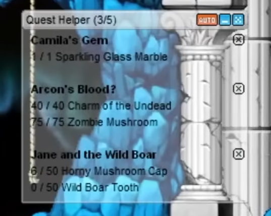
Quest helper should use its proper ui elements and not be a custom look as it is now
screenshot 1
🍅 ME TOO · 0 Sign in to confirm this bug.
COMMENTS 3 replies
Admin ADMIN 2026.08.11

Confirmed — you're right, that tracker is hand-drawn and not the real thing.

Right now the quest tracker on the right of the screen is just a translucent rounded box with plain text drawn by us. The original v83 client has proper artwork for it and we simply never used it: it's stored as "QuestAlarm" and includes a top bar, a repeating middle strip, a bottom cap, a separate slim bar for when it's collapsed, the little orange AUTO button you can see in your reference shot, and the small per-quest button on the right of each row (which even has its own blinking animation for a quest that's ready to hand in).

So the fix is to rebuild the tracker on that artwork — 223px wide, top cap + tiled middle + bottom cap, with the real AUTO and per-quest buttons — instead of the drawn box. One extra step: that particular artwork isn't in the game's local art bundle yet, so it has to be pulled out of the client files and bundled before the new tracker can render, otherwise it would show up blank.
Admin ADMIN 2026.08.11
You're right, and it's worse than a styling difference — that tracker isn't built on MapleStory art at all. It's drawn from scratch: a translucent dark rounded rectangle with "Quests (N)" typed in the corner and "[+]" / "[-]" text as the collapse toggle. Nothing in it comes from the game's UI files.

The real window exists and I found it: it's the Quest Helper (QuestAlarm) window, and v83 ships every piece of it — a 223x25 title bar, an 18px-tall repeating body row, a 5px bottom cap, a 20px collapsed bar, the 21x12 AUTO button and the 12x12 per-quest close button (with its own 4-frame animation) that you can see in your screenshot.

The reason I can't just patch it today is that none of that art is packaged into the game yet — our window-art bundle has 3,473 sprites in it and not one QuestAlarm frame. So this needs the art extracted from the v83 client and packed first; after that the tracker gets rebuilt on it properly, including the AUTO toggle and the per-quest dismiss button. Writing code against sprites that aren't shipped would just give you an invisible window, so I'd rather do it in the right order. Logged with the exact asset list.
Admin ADMIN 2026.08.12
Update — the quest tracker is now the real v83 widget (UI.wz/UIWindow.img/QuestAlarm), and I've corrected two things from my first pass.

What you'll see: the authentic 223px frame with its own title bar, body and bottom cap, replacing the hand-drawn box.

The small button beside each quest is the game's own "Q" button, and it OPENS YOUR QUEST LOG on that quest. In my first pass I had it removing the quest from the tracker — that was my invention, it isn't what the button means, and a Q-labelled button that silently deletes a row would have been a nasty trap. Adding and removing quests from the tracker stays where it belongs: the checkbox in the quest log. That matches the game's own help text, which says you register a quest into the Quest Alarm from the quest log and can hold at most 5 — and 5 is the cap the tracker already used.

The "AUTO" button in the title bar is drawn greyed out on purpose. It's real v83 art, but nothing in the game files or in any reference client says what it actually toggles, so I've left it inert rather than guess a meaning for it.

Also fixed: the text was still coloured for the old dark box. The real frame is light and semi-transparent, so the pale text was nearly invisible over a bright map — the same problem as the death-notice report. The copy is now dark with a light outline, sampled from the actual artwork, and it stays readable over bright towns, dark caves and sky alike. And the buttons in the title bar sit on a whole pixel now instead of half of one, so they're no longer faintly blurry.

Sign in with MSU to comment.